Borrower Portal Improvements (Part 2)
Design and User Feedback
If you haven’t read Part 1 please do it now. Don’t worry, I’ll wait for you.
After completing the wireframes, the next step was tackling the design. I began with the component that displays an offer to the borrower. It was important to help the borrower quickly determine which offer was the better option. My first thought was to show a number that would represent the value of the offer. This number comes from a dataset showing how likely the borrower is to get funding with each financing product on a scale from 100 (very likely) to 0 (not likely). The data is also displayed using a color gradient from green (very likely) to red (not likely). These values were applied to the first iteration of the component.

Offer comparison cards - Round 1
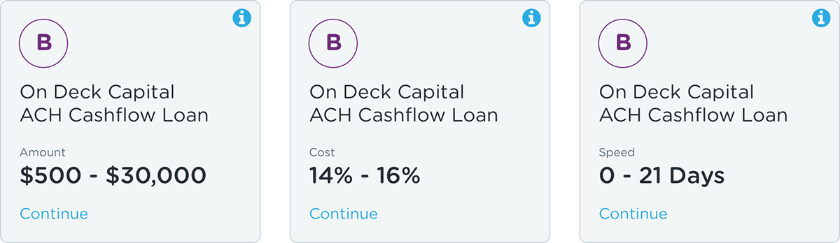
In addition to showing the offer score, it was important to show the lender and the type of financing product. Some other important information was the amount of the offer, the amount of time it takes to get funded (speed), and interest rate (cost) of the loan.
I was feeling good about the initial direction, but I wanted it to be even simpler, more condensed, showing just the essential information. To do this I had to determine which item was most important (amount, speed or cost). I discovered that the application asks the borrower to select which one is most important. That made the solution simple. Whichever option the borrower selected would determine which one to display.
Additionally, I wasn’t loving the offer score or the color value. The score just seemed a bit vague and the color difference might not be easily recognized. I wanted something that felt more familiar and thought a letter grade might do the trick.

Offer comparison cards - Round 2
Things were really coming together nicely. I decided to focus on the option showing the amount. Looking at the amount data for each product showed an average amount funded, the median amount funded or a range of the typical funding amount. I decided to test these three options to see which one would be most valuable.
I created the test using usablilityhub.com showing the three options and asked the respondent to pick which option provided the most valuable information. Results showed that 50% of the respondents felt the amount range was the most valuable. That was good enough for me.

Test results of the amount option
I really enjoyed working toward this solution. I loved digging into the data to see what information was available to present to the user, working through the problems and gathering user feedback. It isn’t a complete solution, it’s definitely still a work in progress, but I’m pleased with the progress I’ve made thus far.